Designing Australia's First Climate Risk Assessment
Led end-to-end UX for a national government platform, transforming manual climate risk reporting into an accessible, structured digital system.
Scope
Accessibility · Gov · Web
/
Client
DCCEEW
/
Duration
3 months
/
Year
2024
/
Challenge
(01)
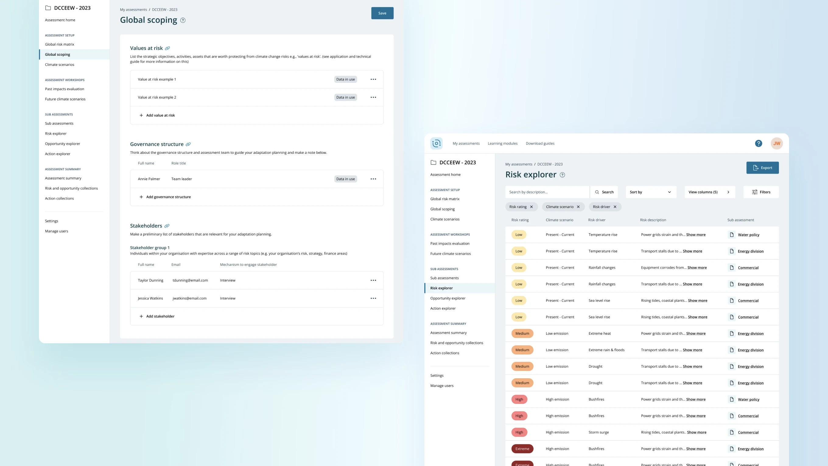
Manual, fragmented and cognitively heavy workflows
At the time, climate risk assessments were completed using multiple spreadsheets and locally saved documents.
This resulted in:
Inconsistent reporting formats
High cognitive load
Version control issues
Limited collaboration
Heavy reliance on subject matter expertise
Difficult navigation of complex climate terminology
The brief was to create a web based tool that improved the user flow, standardised reporting and made climate risk assessment accessible to a broader range of users.

/
Approach
(02)
From discovery through to delivery
1. Discovery and Brainstorming
I worked closely with directors and climate subject matter experts to understand key user needs, workflow bottlenecks, pain points in spreadsheet reporting and required compliance outputs.
From this, we defined a clearer end-to-end user journey and prioritised opportunities for simplification and guidance. The key insight was that their framework was robust, but cognitively overwhelming.
2. Translating Framework into Interaction
I created a wireframe prototype that:
Structured the assessment into step based flows
Reduced cognitive overload through progressive disclosure
Embedded contextual guidance inline
Clarified transitions between tool sections
Designed clear system feedback and scoring outputs
Daily internal reviews with partners, tech leads and SMEs ensured alignment between scientific accuracy and usability. Twice weekly presentations enabled rapid iteration and refinement.
3. Usability Testing and Refinement
I conducted six moderated usability sessions across three days with seven participants.
Key findings included the need for stronger guidance cues, clearer navigation hierarchy, increased visibility of interactive elements and smoother linkages between tool sections.
I compiled a UX verification report detailing insights and prioritised refinements, which informed the final iteration.
4. High Fidelity Design and Accessibility
Following validation, I worked with another designer to translate the wireframes into a modern, high-fidelity web experience.
The final design seamlessly integrated the client’s existing brand guidelines and elevated visual clarity and hierarchy whilst adhering to AAA accessibility standards. It supports keyboard navigation and screen readers and has reusable patterns for future scalability.

/
Reflection
(03)
Deployed a live, AAA-accessible government climate risk assessment tool
Early testing revealed cognitive overload due to technical density. We pivoted to a progressive disclosure model, dramatically improving usability and comprehension.
Impact
Fully deployed government climate risk assessment web tool
Significantly improved reporting workflow efficiency
Standardised outputs across organisations
Made climate risk assessment accessible to users with varying expertise
Delivered a AAA-accessible, scalable digital platform